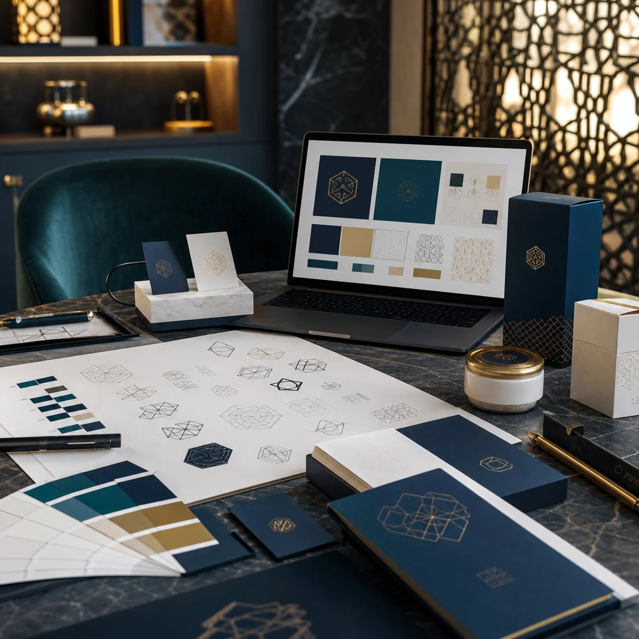
Brand Identity Design for Startups
Brand Identity Design is not just a beautiful logo or an attractive color palette. A visual identity is how customers recognize, remember, and trust a company. For startups, a strong identity creates a professional first impression and gives the team a consistent language across the website, presentations, social media, proposals, and printed materials.
Brand Identity Design Starts With Strategy
Before drawing a logo, the team needs to understand the brand’s position in the market. Who is the audience? What problem does the company solve? What is the main promise? What tone of voice fits the business? What feeling should the customer have after seeing the brand? These answers keep design decisions strategic rather than personal.
Startups need flexible identities. A company may begin with one product and later expand, or serve one segment and then enter new markets. Therefore, the identity should be easy to apply and grow with the business.
The Logo Is Not the Whole Identity
The logo matters, but it is only one part of the system. Brand identity includes colors, typography, icons, image style, layouts, spacing, information hierarchy, and even the tone of short messages. When these elements work together, customers feel that the brand is organized and trustworthy.

Choosing Colors and Typography
Colors should support the brand personality. Blue can suggest trust, green can suggest growth, gold can suggest premium value, and stronger colors can communicate energy. However, color choices should be tested across screens, printing, social media templates, and presentations. Typography also needs to be clear, especially for brands that publish in more than one language.
Brand Identity Design Across Touchpoints
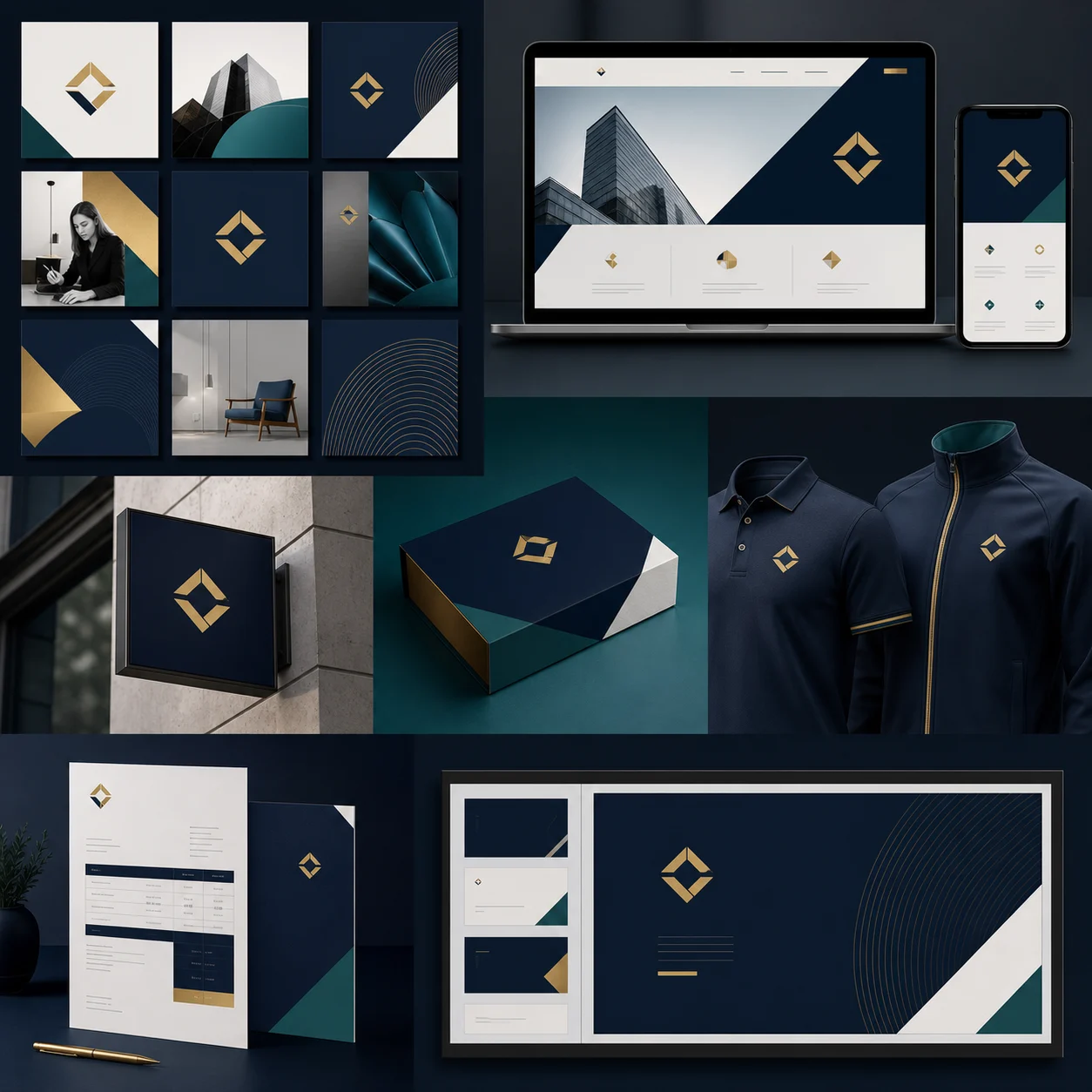
A strong identity proves itself through application. It should work on the website, business cards, pitch decks, social media templates, packaging, signage, ads, invoices, and email signatures. Every touchpoint should carry the same visual logic so the customer feels consistency.
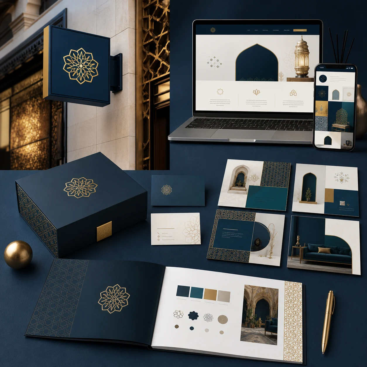
This is where brand guidelines become important. A guideline explains logo usage, colors, typography, spacing, image direction, and mistakes to avoid. As a result, the team saves time and keeps the brand consistent when working with designers, agencies, or new employees.
Common Visual Identity Mistakes
Common mistakes include copying competitors, creating an overly complex logo, using too many colors, ignoring mobile use, and building an identity that does not work in print. In addition, the lack of brand guidelines often causes posts, documents, and ads to look different every month, which makes the brand harder to remember.
Also, identity should not be beautiful only. Because its goal is recognition and trust, every visual decision should support a clear business message. Therefore, good design serves sales, visibility, and memorability at the same time.
How to Know the Identity Is Ready
Test the identity in real situations: a profile photo, an Instagram post, a landing page, a business card, a proposal, an ad, and an email signature. If the identity remains clear and consistent in all these places, it is closer to being ready. If every use case needs a new design solution, the system is not complete yet.
Conclusion
Brand identity design for startups is an investment in trust and differentiation. When the identity starts with strategy and becomes a complete visual system, the brand becomes stronger in the market and easier to scale. Meral Agency helps companies build professional identities that can work across every marketing channel.